
To thrive in today’s fast retail landscape, brands must hone in on a solid visual merchandising strategy. Doing so is the best way to capture the attention of shoppers and beat out the competition. But planning and executing are different when it comes to in-store success and the first step is to know, what defines good vs. bad visual merchandising?
Since our teams love when retail is done well, we’re sharing top insights for developing the best store displays in this post. We’re also going to shed light on visual merchandising problems store teams should avoid. Here’s what you need to know.
How to set up retail store displays
Before diving into specific examples, it is important to hit on the basics. The immediate impact of good vs. bad visual merchandising can’t be overstated. In fact, the average person’s attention span is just eight seconds or less. That’s how little time a store has to make an impression. Stores and brands that do this well know that the best retail displays do more than just catch your eye, they entice customers to purchase.
Store leaders that know how to set up retail store displays focus on these principles:
- Encourage customers to touch and feel the product
- Keep displays fresh and relevant to seasonality and key dates
- Embrace technology to boost interaction when possible
- Incorporate signage that educates people about products
- Keep displays clean, well-spaced, and easy to see
Accompanying merchandising strategy is merchandising execution; the area where top retail leaders thrive. Often the toughest part of good merchandising, superior in-store execution is timeless.
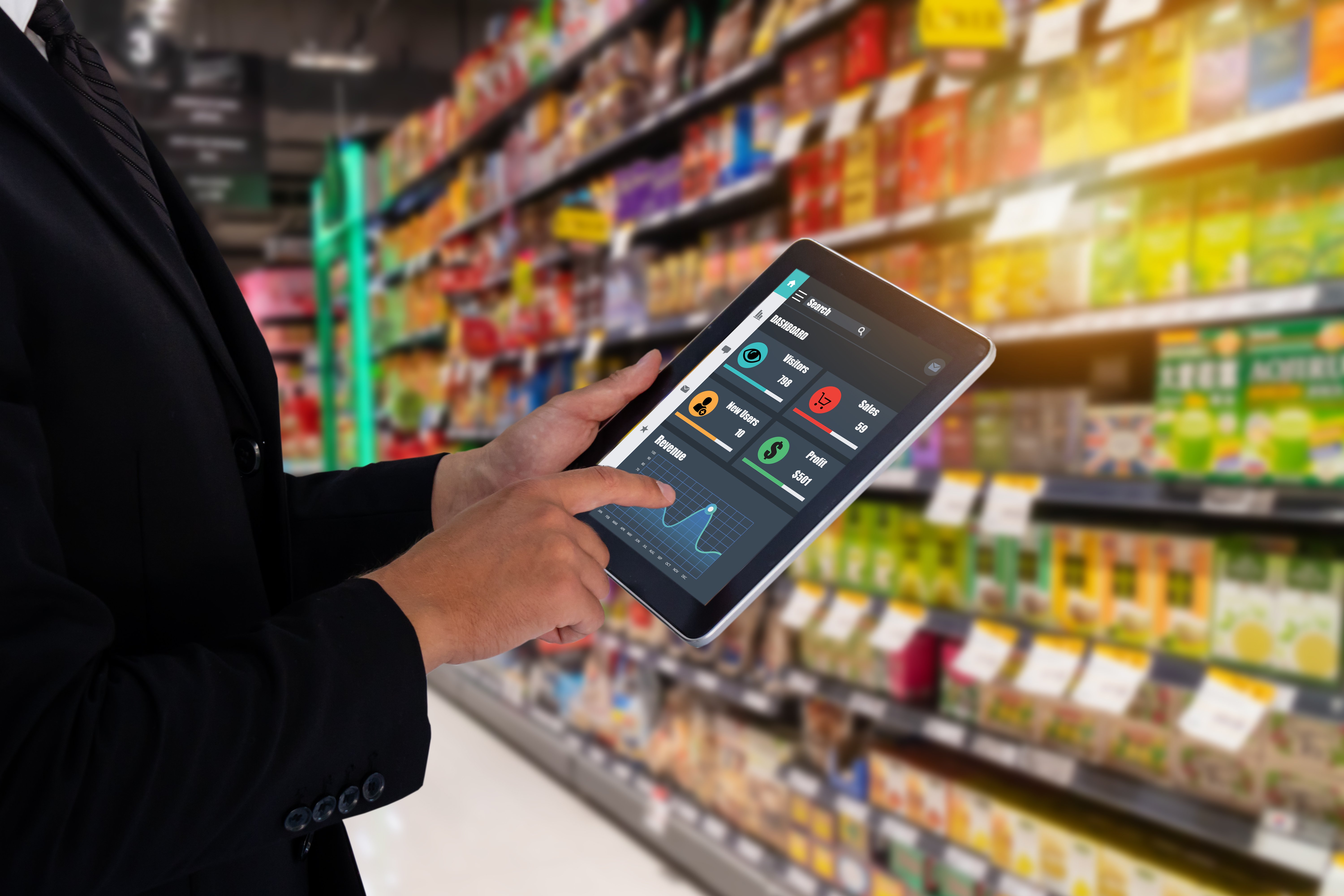
That’s why forward-looking retail leaders now use technology to execute flawless store displays. Offering flexible retail workforce management functionality within a modern mobile app, solutions such as Movista are replacing paper planograms and email. A movement (unlike distressed denim) that is more than likely to stay.
Examples of the best store displays
The best store displays found in retail right now are taking visual merchandising strategy to the next level. Here are some examples and principles to stick with.
1. Experiential merchandising
In-store shoppers are looking for immersive experiences. They want more than the “browse-select-buy” simplicity of online shopping. With this in mind, brands are infusing their displays with interactive elements (often referred to as experiential merchandising).
For example, Ralph Lauren’s smart mirrors enabled customers to change the lighting and view product sizing and various colors – all from their fitting room. Shoppers could even choose to interact with a sales rep. This experience combines the browsing power of online shopping with the dynamic interaction of in-store retail.
Demo products, social media-friendly displays, and augmented reality tech are great ways to roll out experiential merchandising. More recently, fashion giant H&M launched their interactive mirror in stores, shifting the way their consumers shop. Going forward, virtual reality will continue to trend and likely catch on in the cosmetic space as shoppers look for more sanitary ways to test products.
2. Develop brand consistent displays
Consumers love a strong brand, which is why a visual merchandising strategy should always reflect product identity.
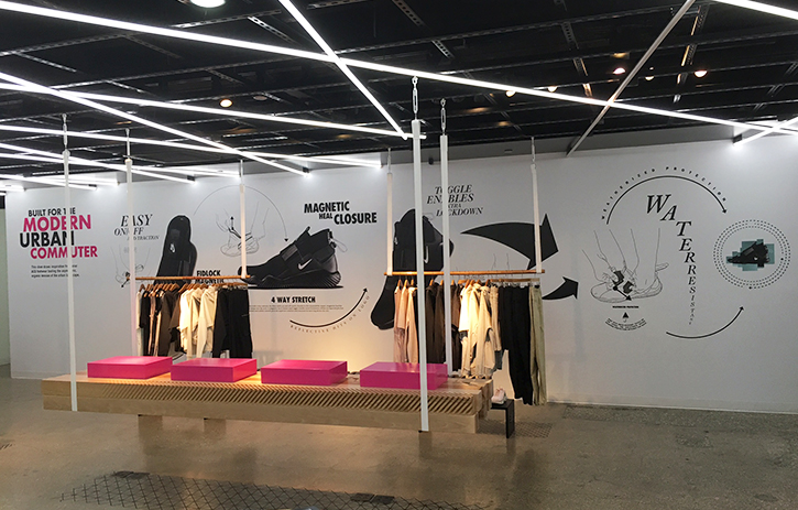
Nike is a great example of this. The company re-introduced the All Conditions Gear product line with eye-grabbing merchandising fixtures. As customers enter the store, they are struck by a simple, bold shape. However, the design makes the focal point change as customers move through the store, re-engaging focus on the target products.
3. Go beyond the store
It’s worth noting that 75% of consumers think companies should contribute to a cause or mission that goes beyond their everyday operations. Whether this is educating or empowering, companies with a compelling mission should allow it to shine through in merchandising.
For example, Gaiam is dedicated to inspiring self-betterment and yoga accessibility. Their user-generated video content and merchandising signs clearly communicate that mission to shoppers.
4. Make color smart choices
One of the best ways to make a display pop? Color. However, choosing colors wisely is different than simply going for something colorful. We like to say, “color-smart is different from colorful.”
The best retail teams develop displays that grab attention and reflect their brand with the right use of color. For some, that may be a carefully color-blocked visual merchandising strategy. For others, it may be purposely colorless. The aesthetic of Apple stores is iconic (and timeless) due to the monochromatic nature of their branding.
Consider brand identity and campaign goals when planning display colors. Companies looking to stand out from holiday season competition, for example, may not want to use red and green despite the fact that red generally evokes the fastest response in shoppers.
In short, find what suits your unique brand identity and campaign goals. This is the best framework to use while planning display colors.

Examples of bad retail displays
The topic of good vs. bad visual merchandising wouldn’t be complete without discussing bad retail displays. There are several ways to miss the mark and create visual merchandising problems. The best teams avoid these common pitfalls.
1. Using unclear signage
Less is more? Studies show analysis paralysis is a real thing. When presented with too many options or data points, many shoppers will feel overwhelmed and simply give up.
When it comes to good vs. bad visual merchandising, clarity is key, especially in your displays. Signs should lay out product information, options, and offers clearly and succinctly. Curate enough details to inform without overwhelming. For example, if a laptop has ten different configuration options, advertise three to five key differences on main displays. Save the additional options for a small sign or knowledgeable employee.
The same principle applies to offers. Promotion signage must be clear. Too many qualifying factors, caveats, and instructions can scare customers off. Remember, if simplifying an offer for display signage is difficult, it may be too complicated to begin with.
2. No logic or flow
Hand-in-hand with clarity comes logic. Shoppers want a display that’s intuitive to navigate and simply makes sense. Good merchandising displays lead customers with cues for where to look, where to walk, and how to interact with the merchandise. Focal points, clear footpaths and supplementary signage like sizing charts and “try me” stickers are great guides.
The alternative? A confusing jumble of products consumers would rather steer clear of than try to navigate. In fact, more than half of customers have chosen to avoid stores altogether because of their aesthetics. If consumers are prepared to abandon stores due to their appearance, they’ll absolutely pass by a display without a focal point.
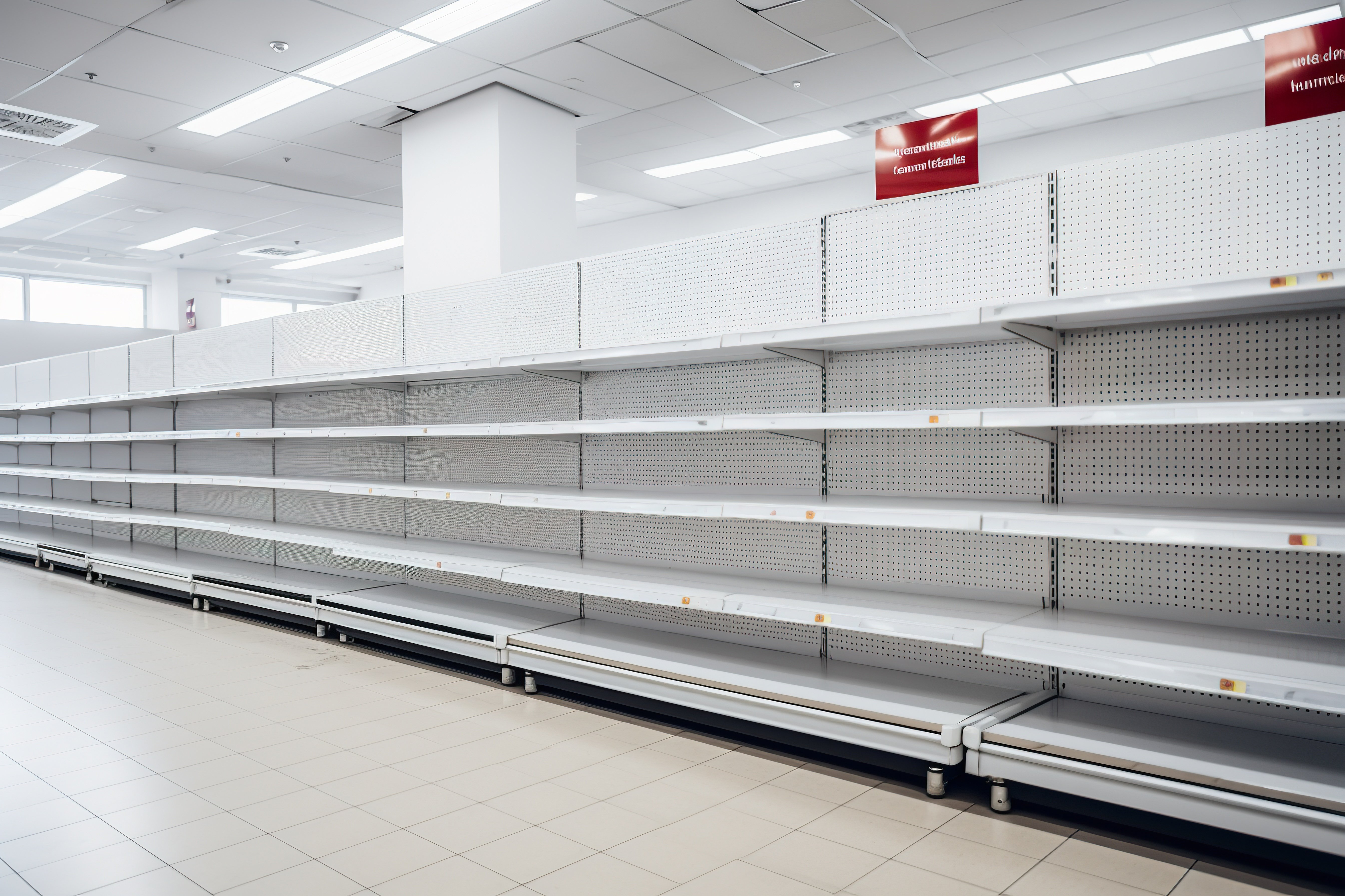
3. Avoid stagnant visuals
Christmas has come and gone, but a display is still stuck in the holiday spirit? This is the epitome of bad retail displays. Don’t let visuals become stagnant. As soon as a season or holiday has passed, teams should make the switch immediately.
However, this is also a good principle to keep in mind all year long. The top retail teams track customer engagement with each display. If something isn’t working, they change it. Regularly updating signage and the appearance of displays is the best way to keep customers engaged.
Where good vs. bad visual merchandising breaks down
A team can brainstorm and design an award-winning visual merchandising strategy, but retail execution is everything. They let the final steps of implementing their vision become the downfall of their display.
Virtual merchandising tools within Movista help field teams see projects to completion with superior retail task management. Movista customers are enabled to increase productivity by having a single solution for planning and doing in-store work. Accessible through a mobile app and our cloud-based environment, Movista delivers an elevated retail workforce management platform that seems like magic.
Movista gives teams a competitive edge through features like:
- Photo verification
- Signature responses
- Surveying capabilities
- Time and mileage tracking
- Item management tools to place orders or issue returns
- File sharing for planogram examples, videos, and more
The best part? As a forward-looking retail technology provider, Movista solves the disconnection issues of retail workflow. Yes, Movista provides integrations that connect to critical business systems and even ERPs. But that’s just the start.
Movista customers can also connect their retail teams to third-party vendors and CPG companies - enhancing collaboration across the retail value chain. Unprecedented? We think so. Incredible? Absolutely. Worth your time for a demo? No doubt.
The bottom line
At Movista, we’ve combined important retail execution functionality with next-generation technology that truly solves problems for stores, brands, and service providers. Why? Because we believe it’s time for all retail leaders to capitalize on all the good without the bad.
If your team needs reliable software that helps you plan, execute, and monitor your retail strategy with ease, we are ready to help.
Movista is the single solution for retail execution and workforce management. Ready to get started? Let’s talk.


featured content

Fresher Inventory Management through Unified Planning and Execution
The key to improving fresh food inventory management is to unify the teams & technology of central planning & store execution. Learn why in this thought leadership blog between Movista and RELEX Solutions.